Company:
Duration:
Role:

MapHabit's science-based and personalized step-by-step guides (Maps) are designed to increase independence and improve the quality of life for individuals with intellectual and developmental disabilities (IDD) and dementia-related conditions.
I joined as a contract product designer to lead the end-to-end redesign of their consumer-facing app — where users create, schedule, and engage with maps, and caregivers track progress and offer support.
Unique challenges:
- Create an experience adaptable to the needs of three distinct user groups:
- Youth with an intellectual or developmental disbaility (IDD)
- Adults with Dementia or Alzheimer’s (ADRD)
- Primary caregivers and extended support networks
- This was my first time stepping into a project of this scale as a contractor, and it pushed me to get up to speed fast — not just on the product and users, but on how to navigate and collaborate with a large cross-functional team to make the redesign as impactful as possible.
Insights:
Over 10 hours of discovery interviews with internal and external stakeholders revealed recurring pain points in the existing MapHabit experience. These insights guided our redesign strategy:
- Information overload:
Users felt overwhelmed by irrelevant content and too many choices.
- Poor navigation and search:
The app was difficult to navigate, with ineffective search functionality.
- Desire for customization:
Users wanted more control to tailor the app to their personal needs and preferences.
- Emotional friction:
Some users reported feeling confused or frustrated while using the app.
- Under-utilized support system:
Involving the broader care network could ease the burden on primary caregivers.
Scope:
- Discovery and stakeholder alignment
- Design system development
- Redesign of existing flows + new feature design
- Usability testing and design QA
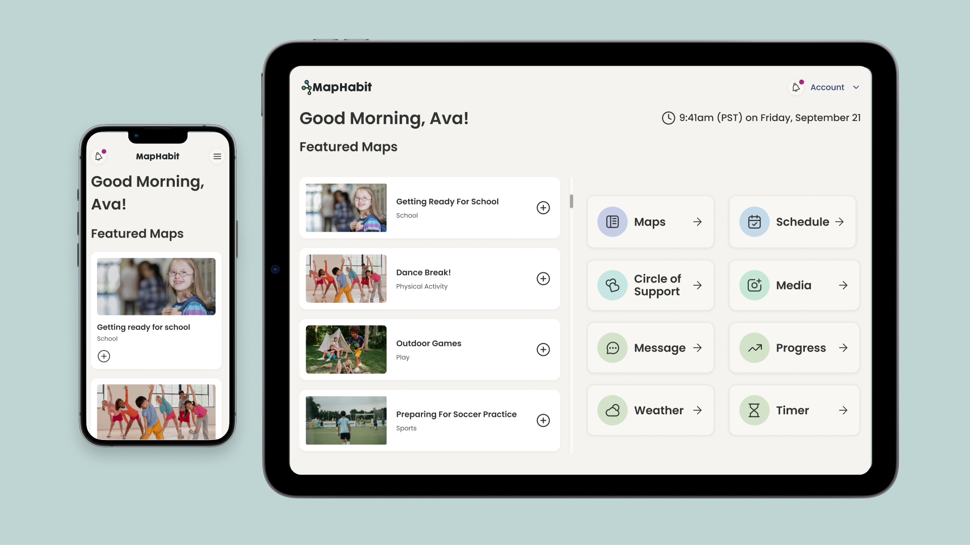
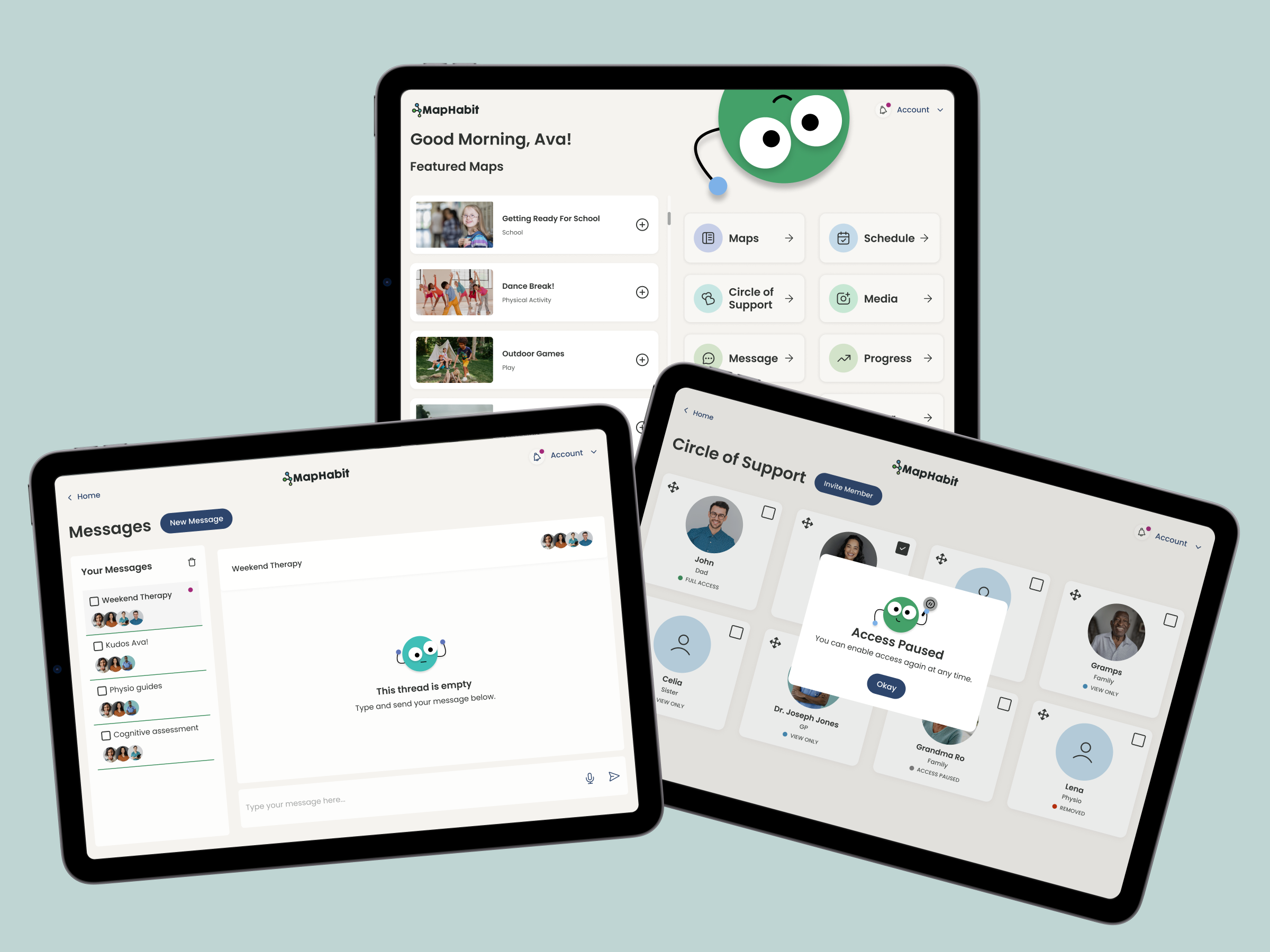
Key features:
- Onboarding flow
- Configurable UI themes
- Customizable home dashboard
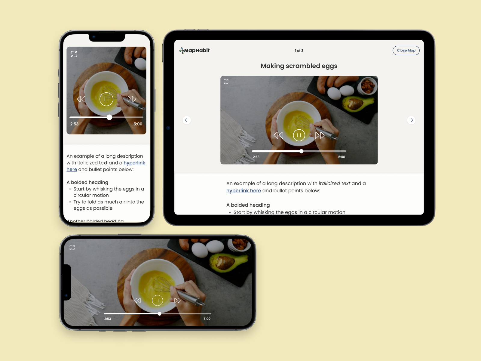
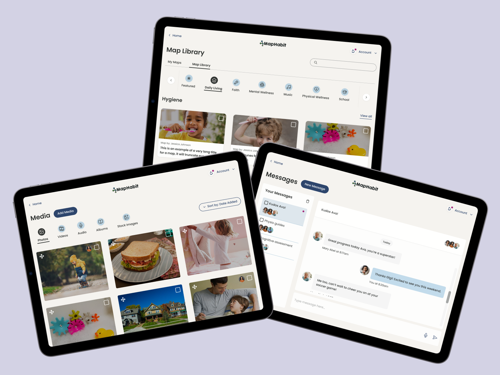
- Redesigned modules:
- Maps (creation + discovery)
- Schedule (calendar + reminders)
- Circle of Support (team management)
- Media (photos, videos, audio for maps and albums)
- Account (settings + support)
- Messages (in-app chat)
Goals:
1. Increase engagement and reduce churn
By simplifying the experience and allowing users to configure it around their day-to-day needs.
2. Establish a scalable design system
To support faster iteration and cohesive growth as the platform evolves.
Design pillars:
In addition to the overarching goals for this redesign, there are three pillars that have guided many of the visual design decisions.
1. Accessibility
WCAG-compliant — from font size to colour contrast and tap targets.
2. Simplicity
A “less is more” approach to reduce cognitive load and support task completion.
3. User centricity
We went beyond standard accessibility and made a number of choices that reflect best practices for the IDD and ADRD communities in particular.